Cast * Story* Interesting Facts * Behind The Scenes * Interview
Cast * Story* Interesting Facts * Behind The Scenes * Interview
Directed by: Piet Kroon & Tom Sito
Written by: Marc Hyman
Music by: Itaal Shur (theme)
Production Start Date: June 1, 1999
Released on: August 10, 2001 (originally
scheduled for a November 22, 2000 theatrical release)
Running Time: 95 minutes
Budget: $75 million
U.S. Opening Weekend: $5.271 million over
2,305 screens
Box-Office: $13.6 million in the U.S.,
$ million worldwide
 |
 |
 |
 |
 |
 |
 |
 |
 |
 |
 |
 |
VOICE CAST
Osmosis Jones... Chris Rock
Leah Estrogen... Brandy Norwood
Thrax... Lawrence Fishburne
The Mayor... William Shatner
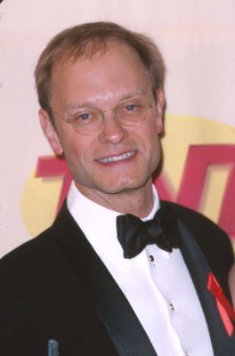
Drixorial... David Hyde Pierce
The Chief... Joel Silver
 |
 |
LIVE ACTION CAST
Frank Detomello... Bill Murray
The Doctor... Ben Stein
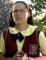
Frank's daughter's schoolteacher... Molly Shannon
Frank's best friend... Chris Elliott
Also featuring director Ron Howard (Cocoon, How the Grinch
stole Christmas).
Frank Detomello, a construction worker, catches the Chinese flu. The
inside of his body is known as the "City of Frank" to its inhabitants,
two of which - white blood cell cop Osmosis Jones, and cold tablet Drixorial
- team up to fight the invading viruses intent on taking over the City.
Meanwhile, out in the "real world", a doctor is trying to diagnose what's
going on inside Frank's body.
![]() Osmosis Jones
combines traditional animation with CGI (for the antibiotic character)
and live-action (about 25% of the finished movie).
Osmosis Jones
combines traditional animation with CGI (for the antibiotic character)
and live-action (about 25% of the finished movie).
![]() Will Smith was
originally cast as the voice of Osmosis Jones, but withdrew from the project
a few months before production started.
Will Smith was
originally cast as the voice of Osmosis Jones, but withdrew from the project
a few months before production started.

![]() Final casting, including Molly Shannon and Chris Elliott, was announced
in late July 2000.
Final casting, including Molly Shannon and Chris Elliott, was announced
in late July 2000.
![]() There's Something
About Mary directors Peter and Bobby Farrelly are the directors of
the live-action segments of Osmosis Jones. Peter Farrelly
stated, "We thought it was a cool script and we wanted to get involved."
He also mentioned that it is not their intent to blindly follow the script:
"That's always the way it is. You go along with the script until you find
a place where it looks better on paper." Animation directors include
Piet Kroon (story artist for The Iron Giant
and The Quest for Camelot), Tom Sito (animator on The
Prince of Egypt, Antz,
Aladdin
just to name a few).
There's Something
About Mary directors Peter and Bobby Farrelly are the directors of
the live-action segments of Osmosis Jones. Peter Farrelly
stated, "We thought it was a cool script and we wanted to get involved."
He also mentioned that it is not their intent to blindly follow the script:
"That's always the way it is. You go along with the script until you find
a place where it looks better on paper." Animation directors include
Piet Kroon (story artist for The Iron Giant
and The Quest for Camelot), Tom Sito (animator on The
Prince of Egypt, Antz,
Aladdin
just to name a few).

![]() Shooting of the live action segments took place in Plymouth. Bobby
Farrelly commented in a September 2000 interview: "It's so beautiful here.
No one's ever shot a film here. That's something we like to do. We like
to shoot where no one else has before." Frank's house in the movie
is at 15 Oak Street, which belongs to Diana and Arthur Budge.
Diana was gardening when one of the location representatives from Warner
Brothers walked up to her and asked if she would be interested in having
her house used in a movie. Diana commented, "I thought she was pulling
my leg." About having his house selected, Arthur Budge added, "I
don't really know how it all happened. There had been much talk around
town about the movie using a local house as Frank's movie home. And Warner
Brothers was looking all around the area for an older, bungalow-style house
in an established neighborhood." Apparently one of the main requirements
the location scouts were looking for was a house with a specific type of
front porch. According to Mr. Budge, "The script requires a front porch
with four steps leading up to it."
Shooting of the live action segments took place in Plymouth. Bobby
Farrelly commented in a September 2000 interview: "It's so beautiful here.
No one's ever shot a film here. That's something we like to do. We like
to shoot where no one else has before." Frank's house in the movie
is at 15 Oak Street, which belongs to Diana and Arthur Budge.
Diana was gardening when one of the location representatives from Warner
Brothers walked up to her and asked if she would be interested in having
her house used in a movie. Diana commented, "I thought she was pulling
my leg." About having his house selected, Arthur Budge added, "I
don't really know how it all happened. There had been much talk around
town about the movie using a local house as Frank's movie home. And Warner
Brothers was looking all around the area for an older, bungalow-style house
in an established neighborhood." Apparently one of the main requirements
the location scouts were looking for was a house with a specific type of
front porch. According to Mr. Budge, "The script requires a front porch
with four steps leading up to it."
![]() Production required about
650 people, many working six days a week over a 10 month period.
Every second of on-screen animation required 10 to 24 drawings.
Production required about
650 people, many working six days a week over a 10 month period.
Every second of on-screen animation required 10 to 24 drawings.
![]() This film is Warner
Bros' third full-length animated picture, after
The
Quest for Camelot and The Iron Giant.An
animator on the project commented in April 2001 that Warner Bros "just
let go the President of Feature Animation (Jean McCurdy) and have no projects
on the horizon. This all comes weeks after moving into the just built Feature
Animation building (which is very empty). If this film fails that leaves
only Disney and Dreamworks (Fox just closed shop)."
This film is Warner
Bros' third full-length animated picture, after
The
Quest for Camelot and The Iron Giant.An
animator on the project commented in April 2001 that Warner Bros "just
let go the President of Feature Animation (Jean McCurdy) and have no projects
on the horizon. This all comes weeks after moving into the just built Feature
Animation building (which is very empty). If this film fails that leaves
only Disney and Dreamworks (Fox just closed shop)."
![]() The script for Osmosis Jones contained gruesome death scenes and
bad language, targeting youngters more than kids -an attempt that had already
failed a year earlier with Titan A.E.
The script for Osmosis Jones contained gruesome death scenes and
bad language, targeting youngters more than kids -an attempt that had already
failed a year earlier with Titan A.E.
![]() Over 7 research
screenings were held by Warner Bros to track the exact target for Osmosis
Jones, from PG-13 back to a PG.
Over 7 research
screenings were held by Warner Bros to track the exact target for Osmosis
Jones, from PG-13 back to a PG.


![]() At the beginning of 2000, Warner Brothers Studios asked animator Michel
Gagné to come up with some concepts for the Osmosis Jones
teaser campain. He designed a set of five posters. Unfortunately they were
all rejected in favor of a more cartoony approach. You can click on the
images on your right to view a larger version.
At the beginning of 2000, Warner Brothers Studios asked animator Michel
Gagné to come up with some concepts for the Osmosis Jones
teaser campain. He designed a set of five posters. Unfortunately they were
all rejected in favor of a more cartoony approach. You can click on the
images on your right to view a larger version.
![]() Prior to the disastrous opening of Osmosis Jones, Warner Bros. Animation
had been extensively planning an animated TV series to compliment the movie
-13 episodes had already been ordered to start airing around the time the
movie was released. But those plans were scratched, however, after U.S.
audiences showed no interest in the Warner Bros. film. The scenario mimics
Disney, which had been working on a Team Atlantis TV series that
it swiftly canceled after not getting the desired box office results from
the animated movie.
Prior to the disastrous opening of Osmosis Jones, Warner Bros. Animation
had been extensively planning an animated TV series to compliment the movie
-13 episodes had already been ordered to start airing around the time the
movie was released. But those plans were scratched, however, after U.S.
audiences showed no interest in the Warner Bros. film. The scenario mimics
Disney, which had been working on a Team Atlantis TV series that
it swiftly canceled after not getting the desired box office results from
the animated movie.
"The U.S. has a particularly strange legacy when it comes to animated entertainment," said Tom Sito, Osmosis Jones co-director. "We've got this hangup that anything animated has to be for kids, and it's not that way elsewhere in the world." Co-director Piet Kroon adds: "We found that we had to cut back on some scenes that involved sexual innuendo, in particular some really funny jokes that had to do with sperm. The interesting thing to me as a foreigner is how they find anything having to do with sex is a problem, but not with violence."
![]() Brad Ball, Warner Bros'
much criticized Domestic Marketing President, distributed the following
memo internally to his marketing/publicity department at WB in August 2001:
Brad Ball, Warner Bros'
much criticized Domestic Marketing President, distributed the following
memo internally to his marketing/publicity department at WB in August 2001:
"Sending out a note about a big opening...#1 at the box office the first weekend, is of course the easier of the two kinds of e-mails. In fact, Swordfish, AI and Cats & Dogs was all about opening to number one! It is when, as in the case of "Osmosis Jones", that the weekend was such a complete rejection by the movie going public, that I say to myself, "now what do I say"?First, that it wasn't without a superb combination of efforts across each department. For nearly two years, literally every month in the past 24, one team or another put forth a major effort on behalf of Osmosis Jones. Well into the start, the Farrelly Bros were brought on board to enliven the tone and hopefully the films appeal. From that moment, whether it was creative executions, early trailer placement to the eventual all encompassing publicity and on-line campaign, nothing was held back to help launch Osmosis Jones as a hit. Multiple research screenings (7 or more) were held to track the exact target for this film...from PG-13 back to a PG. It wasn't the money - we spent plenty on materials and media. We even got a big push from the Cartoon Network as well.
In the end, parents seemed put off by content and it can also be argued that "2-d" animation in this day of CGI, was "out-executed", though the film's animation did have a striking look. But it is important to note, with all this revisiting of our efforts, that filmmakers and production alike truly appreciated your efforts. Marketing wasn't the issue and they know it and have said it.
So, while only time will tell, if any trade analysis of the movie, reports what we all know, let me thank you all in every department for 24 months of focused attention to help Osmosis fight off the competition. It just wasn't meant to be."
BEHIND
THE SCENES
With
directors Piet Kroon & Tom Sito and producer Zak Penn
Article by Paul Peszko published on August 23, 2001 on Animation
World Magazine.
"I think those places where I was pushing had less to do with the comedy of the movie but the scope of the movie," states Penn. "That's what I was always trying to keep my eye on, keeping it big. I would say close to MEN IN BLACK. That was what I was shooting for. I pushed for a much more fantasy, science fiction feel to the whole thing not just in terms of the story but in terms of the design and the characters, making Drix look more Robocop and not funny."
"I really didn't want the characters to look funny," Penn continues. "I wanted them to look cool. And that is where I pushed and pushed and pushed."
"Drix is a character raised in a lab, and all his experience comes from reading about it but not actually doing it," Tom Sito observes. "So, he had a little bit of that fish out of water naiveté. We wanted to show the difference between that veteran street cop and the academy, by-the-book guy, which are classic archetypes in action movies."
"It was really hard to design the pill character," Piet Kroon recalls. "We worked on the assumption that this big gigantic pill arrives in the stomach, but for the most part it's sugar. It's 99.9999 percent sugar, and there's this tiny active ingredient. That's our character."
Sito adds, "One of the issues we had early on in the development, working with the classic cop movie archetypes, was to get a lot of the artists to not be afraid of the cliche. Artists want every character to be multi-faceted. But, if you look at the classic movies like IN THE WATERFRONT, for every Marlon Brando character that's very deep, the hoods around him are very stereotypical. You have to let some archetypes through. If you look at action movies, you see the same characters. You see the hot-headed sergeant, the corrupt politician, the career woman who's turned on by the guy from the streets. Basically, we had to tell people, don't be afraid to embrace those archetypes as long as our main characters have complexity."
Penn spent the bulk of his time working on the storyboarding process, getting the story into shape and trying to bring some of what he had learned from working on larger-budget, more traditional action movies to bear in the process. As a producer he at once recognized the contributions of the various members of the team: "When you see the final movie, you're seeing a combination of Marc Hyman's [the screenwriter] skill as a comedy writer, Piet Kroon's skill as a designer and animator, and Tom Sito's skill as a visual humorist and storyteller, and my skills in terms of action and plot structure, trying to give it that big movie sheen."
Balancing Two Worlds
Some may argue that its big action movie sheen caused the animation
to outshine its live-action counterpart, directed by the Farrelly Brothers,
throwing the finished film out of balance. But, on the other hand, by underplaying
the live-action, Peter and Bobby Farrelly, along with veteran comedian
Bill Murray, made the contrast between Frank's inner and outer worlds ring
especially true. After all, what lazy, beer-guzzling slob on a steady diet
of junk food could be anything but out of balance? If you think about it,
his lymphocytes would probably be on constant red alert 24/7 trying to
fight off free radicals and carcinogens. Pure frenzy inside and couch potato
outside.
"It makes a certain amount of sense in the film because you have two different types of stories going on at the same time," Kroon points out. "You have this action-adventure, high-energy, life-and-death struggle happening on the inside. On the outside it's a guy who's sort of gradually getting sick. He's a really dumpy guy, and he doesn't take good care of himself. He's quite appalling to look at most of the time. It's a small story. There aren't big stakes in it because he doesn't realize how seriously ill he's getting. It's about a father and his daughter, and the daughter's trying to get through to him to change his ways. So, I think in a way it's fitting that there's a different energy in the different parts."
Kroon contends that fast-paced action is inherent in the very process of animation. "Animation is by nature more frantic and higher paced [than live action] because you boil things down to the essential message you want to convey. You don't let the scene meander because it's too much work." Having to draw and paint individual cels for each frame of film forces the animators to keep things brief and furthers the contrast between animated and live-action footage when they are juxtaposed. "In animation you don't want to draw one more frame than you intend to use," explains Kroon. "It's really snappy scenes. They begin, get to the point, and then you're gone. Live-action is really more drawn out."
Tom Sito agrees, "I think that's always a pitfall in an animated/live-action film like PETE’S DRAGON or THE INCREDIBLE Mr. LIMPIT. The bright colors and the fantasy are always more fun. So, the live-action guys had a pretty hard task trying to keep up with us. You know, it's like the old W. C. Fields' thing, 'Never act next to children or animals.' It's [live-action] very easily upstaged."
Multiple locations, not usually standard fare in feature animation, further heightens the contrast between the hectic, fast-paced animated story taking place within Frank and the lethargic, real life grunge ball that Frank is. Penn, who pitched the project to Warner Bros. from screenwriter Marc Hyman's original idea, is perhaps most responsible for that aspect. He comments, "One of the things we wanted to do with Osmosis is have every scene set in a different location and hit as many parts of the body as we can and keep you constantly on your toes. Other than being in a car, which we had to do, we just wanted to get in as many locations as we could. I do think that is one thing that separates Osmosis [from other animated features]. There's a tremendous amount of subplots for an animated movie."
Though the contrasts between the two worlds of Frank are immense, the amazing fact is that the transitions between those two worlds are virtually seamless. But as Sito points out, those transitions had everyone concerned from the outset. "We were worried it was looking schizophrenic at a certain point and we spent a lot of attention trying to make sure those felt right, those felt natural. So, it's very satisfying to hear that people got the logic of it right away. But the other thing we did too was because it's an urban landscape and also an organic landscape, buildings and stuff needed to stay away from hard edges. And we also did a lot of ER, elastic reality, where the buildings kind of sway and breathe and move so that they feel organic."
Creating an Indoor City
Much of the credit in that regard goes to the animation team's production
designer, Steve Pilcher, as Piet Kroon attests. "Steve Pilcher, our art
director, came up with texture maps. He made hundreds of marbled-paper
paintings, just structures basically, and they tended to look kind of organic,
and he would digitize them and wrap them around the shapes in the image.
So, suddenly this really simple shape takes on a much more interesting
structure. That's how we achieved this really simple look that has all
this sophistication. It looks like you're looking at real tissue."
Sito also had a special regard for Pilcher's contribution. "Steve was sort of the point man on creating the design elements of this fantasy world. Especially the color palette where he opted for colors that have gotten a lot of play right now. People have noticed the bold colors and bold styling." Zak Penn called Pilcher, "the author of the look of the movie."
"I think Steve Pilcher in designing the color scheme of the film really made sure to use these primary colors so they would pop from the screen, " Kroon adds. "It's very vibrant and alive. The style, for the first two or three minutes, you're probably getting used to it, but after that, I think people just take it for granted. And the performance really shines through those designs because there's nothing hampering them. The animators didn't have to focus on the creases and follow through on the closing. They could just sort of throw the characters around. If you look at the old designs of Bugs Bunny and Donald Duck, those characters are really simple. They're vehicles for great animation. And we had a really young crew, and they were ready to go for it. And they did."
The animation was eighty percent complete when the Farrelly Brothers and their live-action crew came onto the project. But according to Kroon there was no real compulsion for Sidney Jackson Bartholomew, Jr., production designer for the live-action sequences, to reduce the contrasts between the realism of the outside world and the stylized world on the inside. "Sidney looked at the color scheme Steve was going for, and there are scenes where it matches quite well because Sidney uses the overall oranges and reds. But we were so far ahead of them there was no point in them trying to mimic the look of our film because on the outside it has to look like the real world. It has to look like this guy who lives in this dumpy house. It's not like he [Bartholomew] was looking at our art direction to get some tips on his."
"I was one of the people on the design crew that was always pushing for more urban landscapes, more cityscapes," Sito recalls. "Then as the live-action began to come in and we understood how extensive it would be, I started to go in the other direction because we wanted to make a real difference between the animated world and the live-action world. If the live-action world was going to have a lot of realism in it, then we should go more stylized and colorful to create that sharp distinction."
Enter the Live-Action Superstars
As originally conceived, Osmosis Jones was only to have five minutes
of live-action to frame the animation. However, when the Farrellys became
involved, it was a given that the live-action sequences would become much
more extensive. The story and its characters immediately underwent revisions.
Frank's wife sank into back story, killed off by poor nutrition, and was
replaced by Shane (Elena Franklin), Frank's preteen daughter. Another new
character soon emerged, Shane's teacher, Mrs. Boyd (Molly Shannon), who
becomes the target of Frank's slovenly mishaps and the brunt of the Farrellys'
gross-out humor, some pretty sleazy stuff. So, how did all this new material
affect the completed animation?
"They're wacky, goofy directors [the Farrellys], but they make sure the film has heart," Sito contends. "And we needed to have something in this film that wasn't spoofing or outrageous. And I think without the girl character [Shane], it would've been really hard for people to sympathize with Frank. As an audience, you understand the little girl. You say, 'Yes, this guy is worth saving.'"
Kroon concurs, "I think it was a really smart move on their [the Farrellys] part because it really grounds the picture. We have sort of a spoof on the inside. On the outside, it's anchored in emotion in the sense that you can understand this little girl who's looking at her dad sinking deeper and deeper into his vegetative state. You can understand that she wants him to live. That was a really good call, but it did mean that we had to tweak some of our scenes. Other scenes we had to cut because we didn't get the live-action to make the scenes work."
"The Farrellys came up with a lot of those ideas, but they definitely kept Marc [Hyman, the screenwriter] in the loop," states producer Zak Penn. "They would give him pages to rewrite. They were very collaborative in that sense. It wasn't: 'Here's what we're doing, take it or leave it.' They definitely heard our notes. But with that said, those guys are writers, and they pretty much came up with the take they wanted to do. So now we had three writers working on it, Peter, Bobby and Marc. Even earlier, as a writer, I felt it was good for him [Marc Hyman] to have another writer standing over his shoulder to pitch ideas because Piet and Tom are very talented guys, but I don't think they would call themselves writers per se. They're more pure artists rather than writers, I would argue. Whereas, Peter and Bobby are much more writers than they are anything else. So, once they got involved, I did have to take a step back. I didn't want to get in the way of their process."
Their process, however, came from a live-action perspective, which is often based on the logic of seeing is believing. Therefore, the other twenty percent of the animation that had been storyboarded but not shot was then under review. "What I did end up doing was arguing a lot for keeping stuff in the animation," explains Penn. "There was a big argument at one point about cutting the subconscious. But to be fair, there was a point at which it was very hard to relate that idea in a storyboard. It was very difficult to explain to everyone what we had in mind. I particularly remember getting a lot of arguments and saying, 'You have to trust us. When we finish this, it's going to look fantastic.' That came up a lot because they [the Farrellys] did come into the process a lot later. So, there would be things where I would have to step in and say, 'Look, guys, I've worked on a lot of movies also, and I really think we should give this its day in court.'"
Of course, for every argument you win, there are always one or two that go by the wayside. "I really wanted there to be car chases in this movie," Penn remarks. "We had this pretty amazing idea for a car chase, which was a car chase in 3-D, where the cars get knocked off the road then land upside down and backwards on a different vein. There was all this stuff that we had beat out and actually boarded and started to animate that mostly got cut for a lot of reasons. So, some of that stuff we didn't win the arguments on, and maybe it was for the better. Maybe it made the movie tighter and funnier."
The Harsh Reality
Regardless of whether the film is tighter or funnier, today's box office
heavily depends on advertising dollars and marketing tie-ins. Big bucks,
big box office. No bucks, no box office. No amount of time-release capsules
or blood transfusions can save OSMOSIS JONES if Warner Bros. did not learn
a lesson from its ill-fated experience with THE
IRON GIANT.
"I think the studio understood what went wrong with THE IRON GIANT campaign," suggests Sito. "Even though they spent money, it was aimed at a very young audience. So, if you were like six and under and watching TV on a weekday morning, you saw a lot of IRON GIANT ads while most of the movie was geared toward adults. I think they revised their commitments and used a lot of OSMOSIS JONES ads in prime time and running on VH1 and MTV late night trying to find that other audience. In that respect we owe a debt of gratitude to SHREK in that we were getting resistance in some quarters from those who really felt animation was for children."
"On our film, for my money, I would love to have seen more advertising," Kroon counters. "It's really weird to see all these ads out now for HARRY POTTER, which isn't opening until November, and it's probably the one film that could open with a little line in a newspaper saying it's finished. But our film by comparison needs a lot more nurturing because it's original characters and not based on a book or anything. I think they should have been pumping it a lot harder. But compared to THE IRON GIANT, we're getting a really great deal."
But THE IRON GIANT is dead and buried
and, unfortunately, so is OSMOSIS JONES; ten days and $10.3 million (even
though the film remains on over 2,300 screens in the U.S.). So, great deal
or not, the City of Frank and Osmosis Jones didn't survive their crowded,
highly competitive August release (pushed back from an April, Spring Break
release). Furthermore, it has little to do with its imaginative story structure
and slick, stylized animation. It has everything to do with the growing
pains of the American animated feature as filmmakers try to coax the public
into believing there is life after Disney. Animated projects can be huge
blockbusters as SHREK recently proved, but they
must be handled with great attention and care. (Was there a child in America
that didn't love SHREK before it even hit the
theatres? Is there a child that doesn't go to the grocery store with their
parents, where they were cleverly bombarded with marketing?) When it comes
to nurturing animated products, Warner Bros.' marketing department lies
comatose with their vital signs about to flat-line. Let's hope they get
yet another chance.
INTERVIEW WITH THE SCREENWRITER & PRODUCER
Interview by Smilin' Jack Ruby from 13th Street with screenwriter Marc Hyman and producer Zak Penn on July 14, 2001.
Q: So, how long ago did this start coming together?
Marc: What was it, four years now?
Zak: Three?
Marc: No, four years ago - I think it was in July...
Zak: Right...I was working on Antz, because myself and the executive there conceived the story of it and I was busy writing...I was actually writing The Hulk at the time, so I couldn't go to write Antz, but I was serving in a producorial capacity on the movie. Because of that, I got to know Katzenberg and Nina Jacobson pretty well. Marc was just a friend of mine socially and he one day pitched me an idea for an animated movie called Fish Out Of Water, which was The Right Stuff set five hundred million years ago in the primordial pool and literally, the next day or so, sold it to Dreamworks. He started on that and while we working on that project in development with Nina, Marc came up with the idea for Osmosis Jones.
Marc: Which we pitched to Dreamworks. It was less than a perfect fit. Then we pitched to Warner Brothers...
Zak: Yeah, and Warner Brothers bought it.
Marc: Warner Brothers bought it and it's just sort of been up ever since. I wrote a draft of it at the end of that summer and it's always moved forward.
Zak: It was a strange situation because most animated movies are done where there's a story or there's an outline. Like Antz - they went forward off an outline that Nina and I basically cooked up with another writer.
Marc: On Osmosis Jones, they put us with some executives who got fired pretty soon after and everyone was pretty pre-occupied.
Zak: Everyone left, they basically shut our division down because of Quest For Camelot soon thereafter. So, what happened was, all the people who were working with us were gone and literally for awhile there it was Marc and I sitting in this abandoned office out in Glendale. One of the things that was good about that - we had an executive named Courtney Valente over at Warner Brothers - but they basically left us to our own devices to write the script. At least to conceive of the movie, we didn't have like a hundred people giving input as to what the movie should be and so, it kind of gets lost in the mists of time, but the two of worked on this thing for like a year, just on this script. Animated movies aren't usually made from a completed screenplay, so that helped tremendously because it really helped inform...it's amazing. I've been through some very nasty experiences in Hollywood and this one has been incredibly smooth in terms of - if you go back and read that first draft, it's still pretty similar to what the movie ended up being.
Q: That's what I was going to ask. When you pitched this, what has really changed since then?
Marc: Well, a few things changed. In the very original...very little has changed from the actual pitch. I have the pitch cards I used when I pitched the story. I did conceive it originally that the whole thing would just be about...have you seen the movie yet?
Q: Yes.
Marc: Would just be about a common cold. At the end of the movie, in the pitch, his wife said - Frank had a wife, not a daughter at the time - said, "Honey, are you feeling okay?" He said, "I thought I was getting sick there for a minute, but I guess I'm going to be okay," like the whole movie was that.
Zak: It was a counterpoint between how little he cared in real life versus how much we cared in the movie.
Marc: Yeah, and it wasn't a change...it was a change that I think we wanted to make to make the stakes greater and make it a life or death illness. That's one change. Thrax was originally conceived as the Hong Kong flu who was a bad ass Asian virus - sort of a Jet Li character. Other than that...the live-action...
Zak: Yeah, the live-action changed.
Marc: The live-action story was originally Frank with a wife...
Zak: But even that, it's kind of amazing how little like - it's still about a guy named Frank who is a slob, who doesn't take care of himself. I mean, even from the beginning...
Marc: There's a mayor who wants to take the trip, take the body on a vacation where he's going to get even fatter. It had been Florida - I think that got changed.
Zak: The stuff that's changed - a lot of stuff has been added along the way as storyboard people became involved...
Marc: The final climax on the eye was not something that was in the original draft, either.
Zak: Right.
Marc: It used to end with the fight on the uvula and the bad guy being, you know, spit out of the body. But, in the scheme of things, not a hell of a lot. There's a lot of stuff in it that are jokes...there are a lot of first draft, you know, "cells vote-man cells (sells) vote." I mean, there's a lot of just, "stuff" that's just the way it always was.
Zak: Cells divide with themselves.
Marc: Those were all in the early, early drafts.
Zak: Actually, the one big change...I don't know if you care (Smilin' Jack Note: I always care!), but there's two changes that were relevant. One was, that we - somewhat based on a studio note that we agreed with - shifted Ozzy's character from this very tough, almost Clint Eastwood-type cop...
Marc: We were developing it for Will Smith. Originally, Will Smith was going to be the voice and it played a bit more into the sort of, "he's the blackest white blood cell!" and he's supposed to be tough and he was a little bit better with chicks.
Zak: But that didn't even get altered until we were in production. I mean, that was...
Marc: We wanted to make him more of an underdog.
Q: How about the details? Like the police in the nostrils with the snot guns - how did all the little details come about?
Marc: Actually, that one was in the script. The snot guns and all.
Zak: But a lot of stuff got developed. We had a very good production designer, Steve Pilcher who...and also, we had some very good special effects guys. The effects look really good in this. They looked good in Iron Giant, too. Like explosions and gunshots and things like that. What's kind of great is, after awhile and things got rolling, we had this whole team of people who would just constantly throw out ideas and Marc could just take whatever he wanted and put it in the script.
Q: About a year ago, Warners took us on a tour of the animation studios over on Sepulveda and we got to see things like the smoke turning to molecules and a lot of the other details. How much of that was there from the outset and how much came once the look and feel of the movie was in place?
Zak: I can answer that one. That was something specifically that they developed. They said, we came up with this cool molecular effect, how can we use it? So, that got put in. One of the that was really great for Marc and I was, we basically like, for example, Thrax being more like an anime-looking character, was something we pushed pretty hard for, like not something silly-looking. We wanted a villain that looked scary and more realistic. There was a lot of input and a lot of back and forth about the character design and the look of the world, but Steve Pilcher came in...well, actually, if you remember, even the earliest concept drawings I remember sitting there and saying, more realistic. Even though it's kind of cartoony, we want it to look like...you know, the original pitch of this movie is, it shouldn't be a silly movie. It should play like Men In Black or something.
Marc: Or a Joel Silver/Walter Hill movie inside the human body. It was part of the pitch for it to look like a city in disrepair. For it to look like San Francisco in the '70s or something.
Zak: And we kind of went away from that to a more like retro-futuristic, like a weird like Jetsons...
Marc: Because we weren't there that week and somebody said...and the next thing we knew, it looked like The Flintstones, but...
Zak: The only thing is though, I think it's to its advantage because it became a lot more colorful.
Marc: Yeah.
Zak: There was definitely this...I mean, a lot of the action got cut. I'd say the biggest difference between the final movie and the first draft is that there used to be like, a three-minute long car chase through the veins in the beginning. There were a lot more action sequences that just got cut because of time and also because of tone.
Q: Was this always aimed at kids or were you trying to aim into a higher age bracket?
Zak: That is a good and...
Marc: Poignant.
Zak: Right. (laughs) I would say, at the beginning, we thought we were making a kids movie. We wanted to make something that was more like the Pixar movies where it appeals to everyone.
Marc: We wanted to make a kids movie with a few sloppy moments, like a little bit of sexual innuendo, a little bit of violence, a few things that were maybe beyond a kid's theme, but then what happened was that then we started working with the Farrelly Brothers, they picked up on what was in the script and that there were already a fart joke or a crack joke or whatever it was and then amped up that side of it. You know what I mean? Then all the conversations were, wouldn't it be funny if this...? What we were left with was a movie that was now PG-13 that we absolutely didn't want.
Zak: It wasn't truly PG-13. It was like a PG-13 for...like, it was only going to appeal to 11 year-olds. You know what I mean? Only people on the cusp of being PG-13. It started, in conception, it was an animated movie - make it for kids! And we really were trying, we were using...I think those Pixar movies are some of the best movies that have been made in Hollywood period. I mean, I certainly think the Toy Story movies are and we wanted to make something...even Antz, like, I was hoping with Antz...what inspired Antz was trying to do something on this incredible scale, like how cool would it be to see an ant in a battle? The first scene Nina Jacobson and I ever talked about was a battle between termites and ants and it's weird, it actually made it into the final movie. On Osmosis, we were like, wow, the scale on this is like a hundred times the scale of an ant. We always felt that this should be like a big, action-adventure movie, but the PG-13 route? We really would've had to start over. Like that was what was weird about it. We were adding in some PG-13 jokes in a movie that's essentially not built to be that way, so we ended up pulling back on that a lot. Even the Farrellys were like, you know, it feels like these jokes are too harsh for this movie. When we showed it to parents, we got the same reaction, which was, "Wow, I was liking it so much and then there's a scene with naked girls..."
Marc: Or when David Hyde Pierce goes, "Hasta la vista, bitch!" You hear something like that and go, "oh, my."
Zak: Which might have been our tastes, but whatever.
|
||||||||||||